My involvement with marketing departments tend to be a slow burn. An email design here, a functional graphic there, and then working up to a helping with a rebrand (more of a refresh in this case). Because of my broad skillset I tend to reverberate between software development and marketing and when the teams are small enough, I try to act as a bridge. Especially when marketing defines branding with a lack of web designers, keeping the UI on brand becomes a shot in the dark if you don't have a system to guide you. Bringing order to both would not only make things easier to maintain and produce, but make a more unified customer experience.
Emails were one of the main ways the company updated our customers on new content, event announcements, and new features. However, the emails were developed over the years by different designers and developers who reused old code throughout the years with unexpected results in different email clients. We had the budget for some email pros to develop a set of emails that I designed. Over the course of a few weeks we had a set of emails that marketing could easily update, maintain, and reuse through Marketo. It was even compatible with older versions of Outlook 😵.
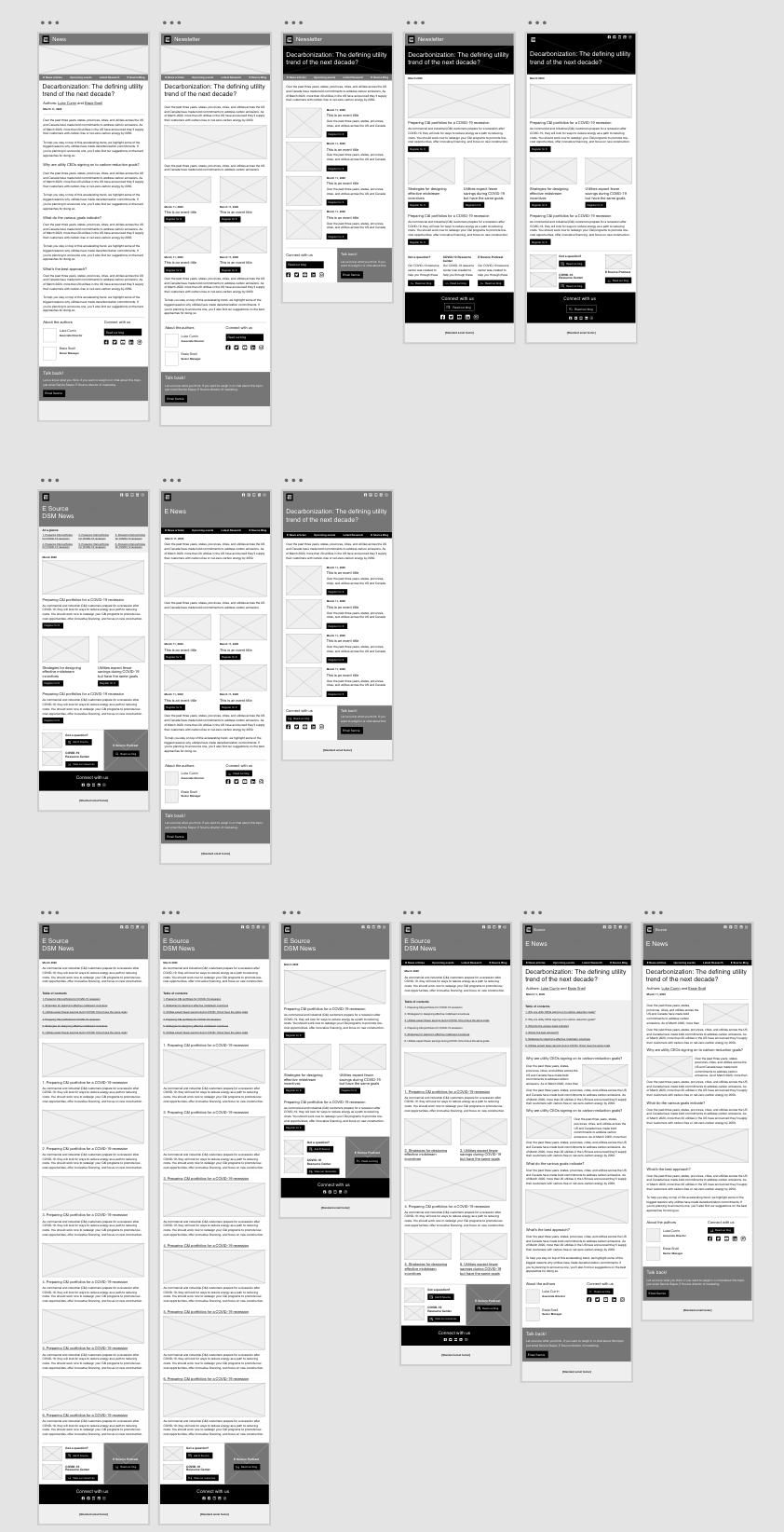
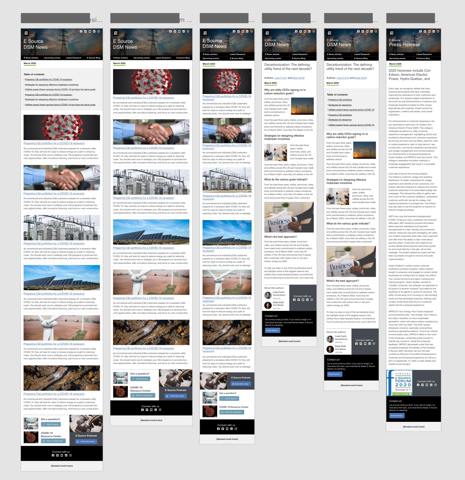
We had several emails types for customers. The goal was simple, create a focused reading experience to make it easier to scan.
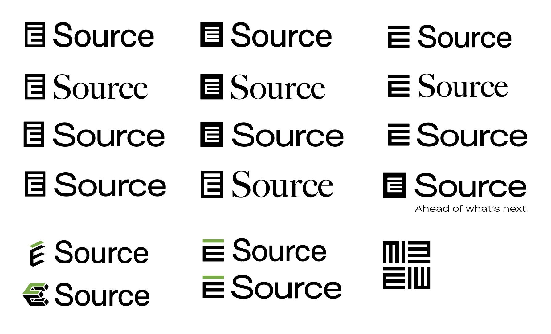
While in the middle of an app rebuild the company had almost doubled in size and needed new branding to represent the new capabilities of the organization. Back when we all held out hope of being able to publicly gather, we needed the rebrand ready for the company’s annual event. But because it was the first time the organization was putting on a virtual event and hosting the largest amount of people in the company’s history, we had to ship it by then. Knowing that I built a few brands before, I was tapped to assist our brand manager in ideating on some logos while she handled contractors to fill out the rest of the design updates. (You can view the final logo in action on their website.)
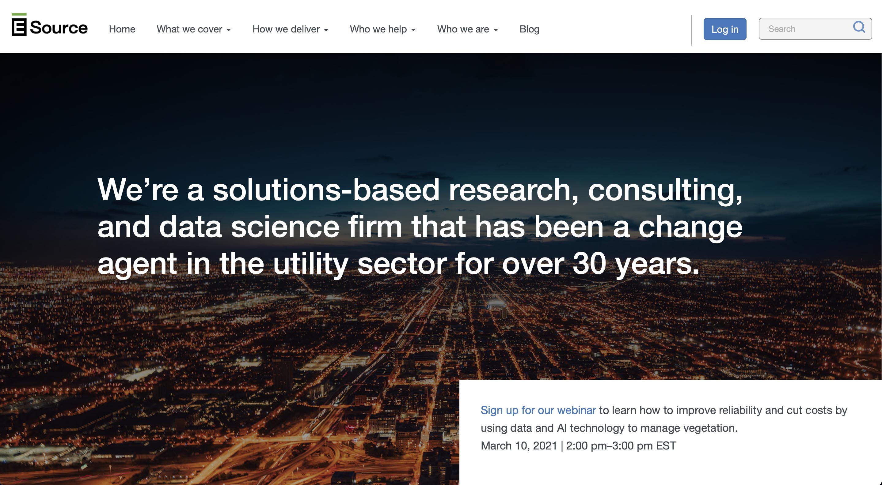
The final phase of the rebrand roll-out was our main website. We essentially squeezed 6 months of work into 3, but to achieve this, we decided to keep the UI and visual updates simple and similar enough to what we already had to meet our deadline.
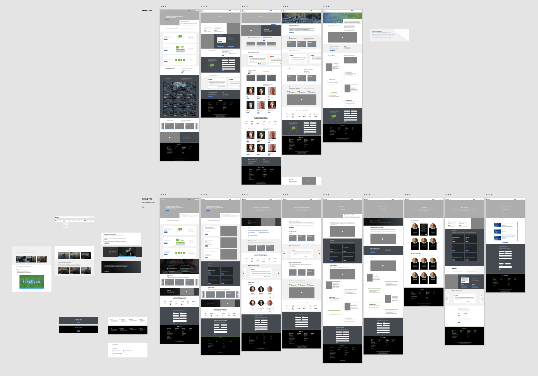
The effort took a village, but with weekly design iteration, long nights, and compromise –– we prevailed. (Queue Final Fantasy win theme)