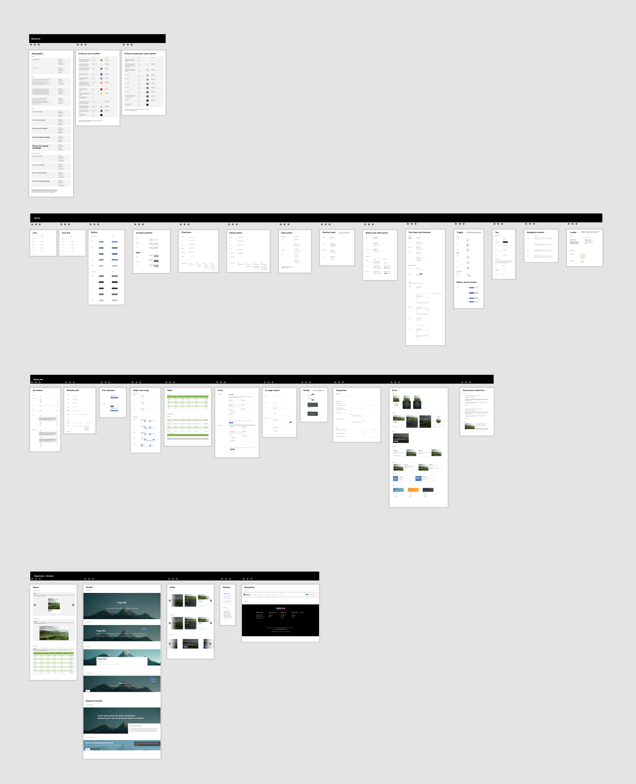
When I joined the E Source software development team each app had a unique fingerprint. A button that was a different shade of blue or font sizes with subtle variations. Designers and developers of past and present could be identified in the features they created. Although this a common story among busy teams with tight deadlines, I took it upon myself to commit my time to create a design system to help our team ship faster. The result was a comprehensive design file that could also be accessed online, several code example pages, and sprints worth of incremental releases to update past tools and interfaces.

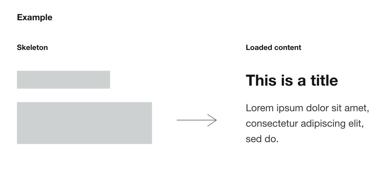
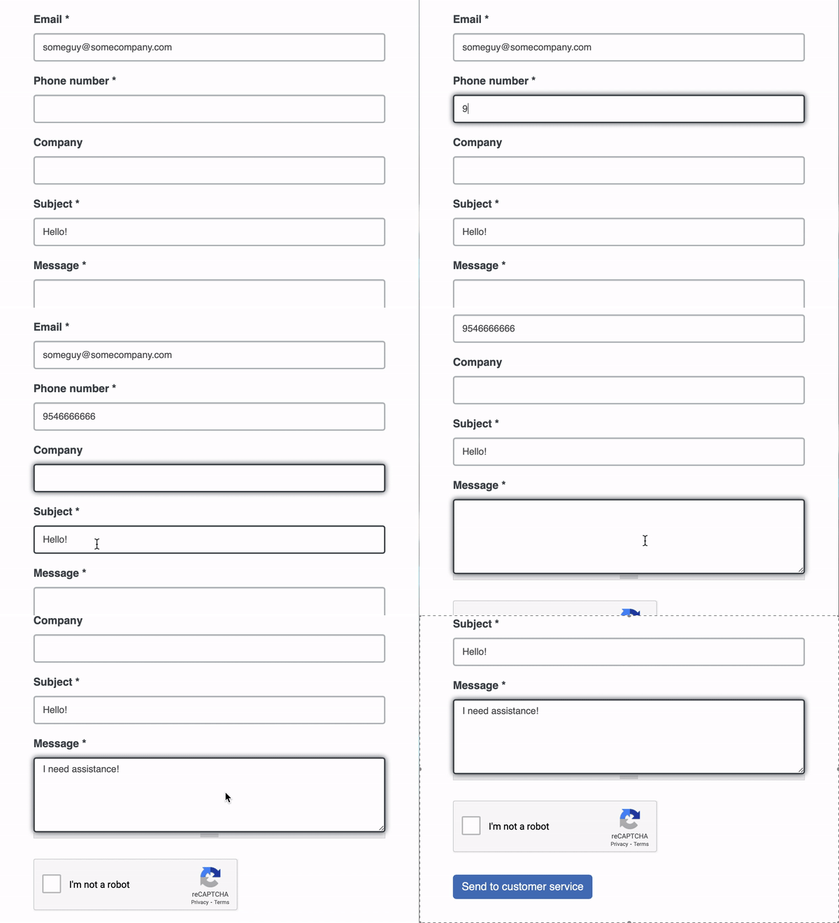
Loading states, editorial styles, and form inputs oh my!

Documenting everything from color palettes to component-level micro-interactions all while checking for accessibility and consistency as we went along. Everything had to be justified and the selection process was ruthless. Like the crucible of the natural world, only the most effective designs survived.
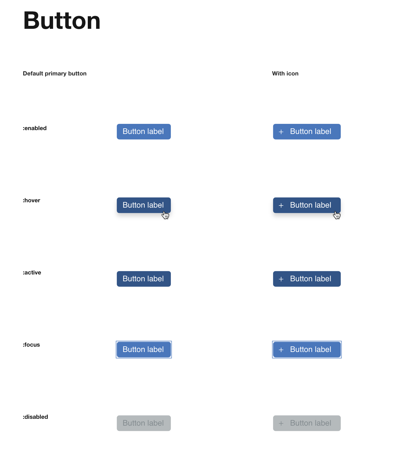
I became increasingly meticulous with interaction state documentation as I found more examples during my audits that were inconsistent (or just plain different).

It all started with innocuous questions like “why is this button teal?” or “why is this 23px instead 25?”. Trying to approach this new animal with curiosity rather than judgement I needed to audit and create records of its variations to make a case for how might we use some of these variations in a more consistent way. Whenever I could find time I worked to standardize components and introduce more simpler type scales to better fit the editorial nature of E Source content.

Fun fact: Backpfeifengesicht is one of my favorite words to use to sample type with and it's also one of my favorite German slang words.
But it wasn't just software development that used our front-end code and there were new divisions of the company that developed on complete different stacks than the software dev team. An environment-agnostic approach needed to be considered to accommodate the needs of software development, editorial, and data science. Since a standalone site could not be approved I had to devise multiple yet maintainable sources of truth. One that anyone can view and use to build on their stack and one for site editors to craft content faster. And as counter-intuitive as that sounds, it worked for the organization.

Several sessions of cataloguing 20+ apps for a few months yielded a list of tickets to address anomalies, inconsistencies, and bugs. We were able to remove and update hundreds of lines of code while adding new standards for appearance, behavior, and accessibility. I even updated an old Grunt-based build process to a more maintainable build pipeline using Gulp and npm. This alone greatly decreased time to have to write fallbacks for our IE10 EULA (💀) while also providing a nice performance boost.
While it was never granted the resources to focus on it more intensely, I was able to create a little order in a big, tangled ecosystem. And despite this, editorial was able to produce content more efficiently, code became more maintainable, and new ideas could be explored in less time. A success that will continue to give back to those who use it.
