Acquiring a startup and their tech in 2020 is already a bold move. Rebuilding it from scratch in less than a year is bolder. The original tool had great value to its customers but was borderline unusable to anyone who didn’t already live and breath energy demand management. Being built with a third-party front-end that seemed boundless in its capabilities resulted in two things –– high-cost customer training and endless feature requests with the ability to add new data points at will. The perceived value lead to something that became harder to maintain and the third-party front-end membership alone added a massive annual cost.

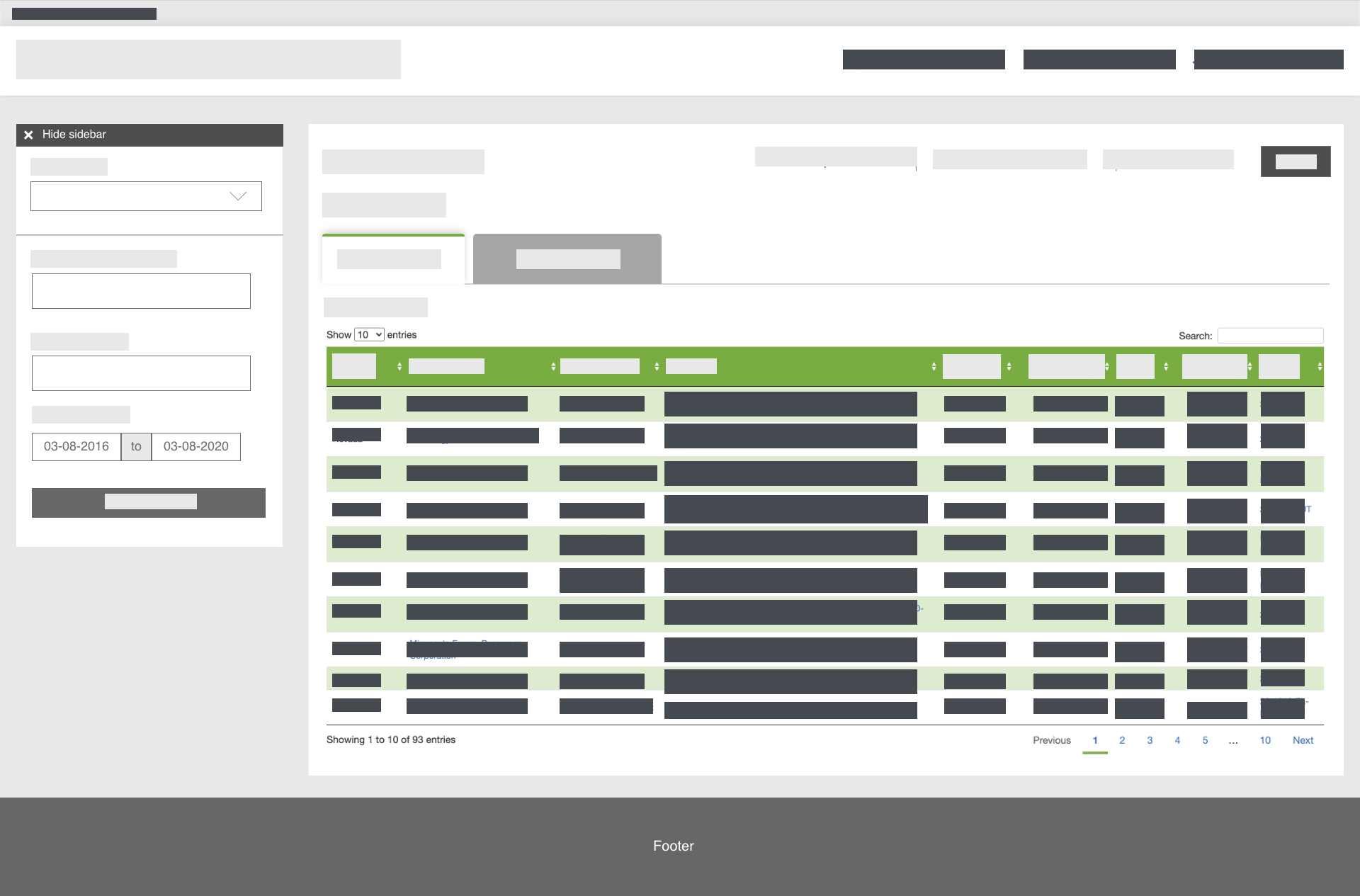
I have to redact 90% of this but you get the gist. Accessible sidebar controls to filter through lots of tabular data with charts and maps. Simple yet powerful. We even added an accessibility menu to update font sizes, invert colors, remove animations, and more.
If you want to see the full case study, please send me an email for the password to get full access.
We spent about 2 months gathering requirements, learning about the tool, and documenting its intricacies. We asked ourselves how we might make the tool more performant and friendly to new customers while providing the same value, depth, and power of its predecessor. Initially slated for a tentative year long timeline for the project, our timeline get’s cut almost in half 4 months in, and then the pandemic happens.
Don’t panic.

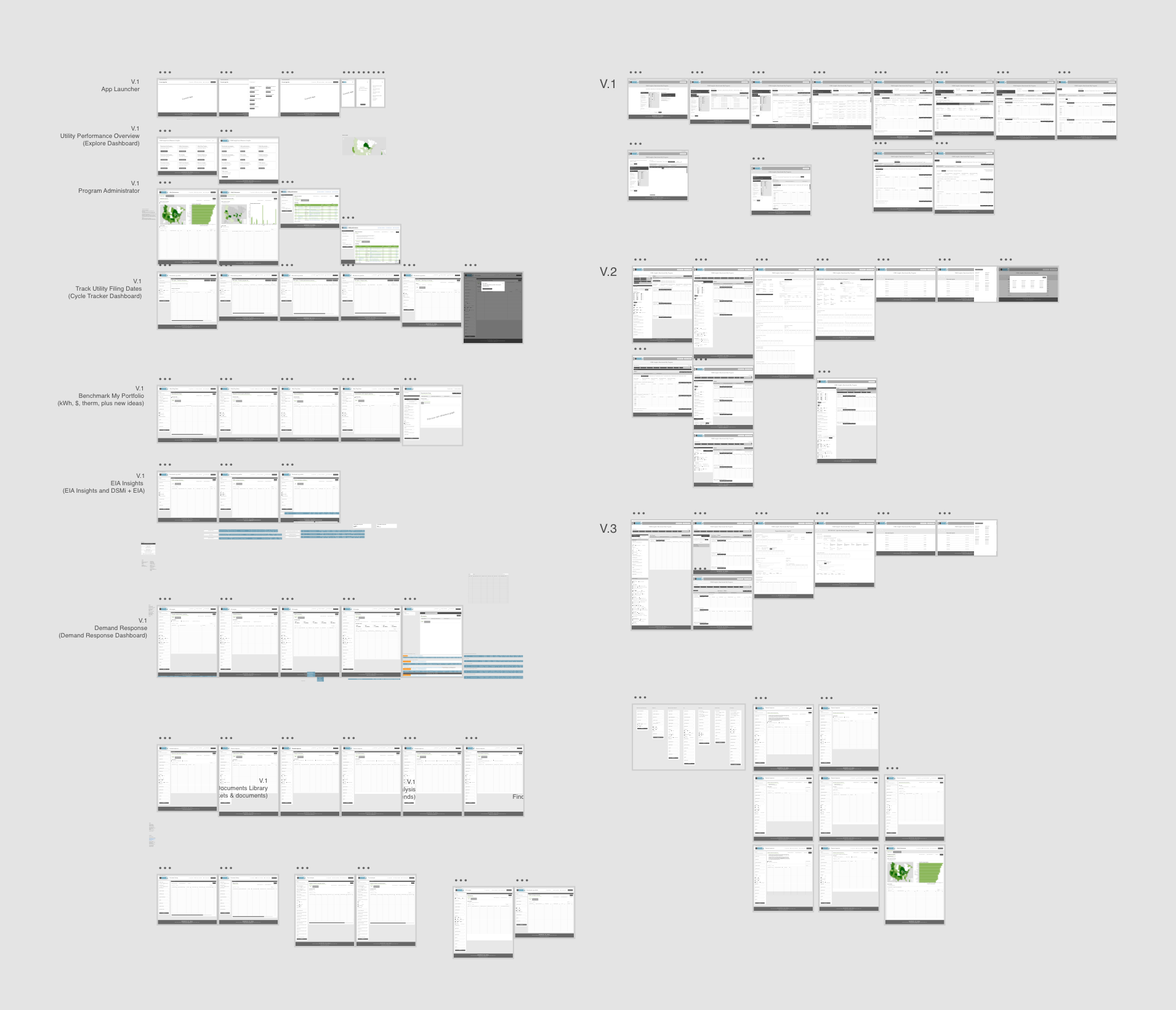
We held weekly meetings with our stakeholders to keep everyone involved accountable and on-pace. It was a balancing act of breaking down our past and present assumptions of the tool with several rounds of user interviews and relying on our stakeholders’ deep domain knowledge as a guide. We would design a feature take it to stakeholders for approval and test it with users to iterate effectively. The Adobe XD file I ended up with was one of the largest I've worked on –– behold.

Our wireframes were kept low-fidelity for clarity and focused on rapidly testing to iterate quickly. Building the front-end for the application was incredibly simple utilizing R Shiny (and having a kick-ass R developer on our team) that allowed us to extend the front-end with very little custom code. With the company’s brand refresh in tow –– more on that later –– I had the opportunity to create some little logos for each dashboard of the product to make the rebuild more impactful.
Being granted the budget to user test at different stages throughout the rebuild allowed us to make meaningful enhancements. We were able to identify successful design patterns to reuse and technical bugs to address. The interview process was structured around a diverse groups of participants with different experience levels with the previous tool. The data collected was synthesized into feature updates and bug lists.
The launch was a success with minimal hiccups, customers loved it, everyone was happy. And our customer training time and maintenance costs reduced to almost nothing. 🎉🥳🎉