Rebranding happens for a lot of reasons - expansion of business, acquiring a new company, or maybe realigning to pivot in the market. But whatever the reason, it’s a collaborative effort, sometimes across multiple sectors of the business to bring the new brand to life under a new banner. At the time my responsibility was to translate the new company logo my senior designer was creating and expanding it to the UI of 3 websites. The result was a cohesive UI design system that brought the 3 brands under one roof and boosted engagement and sales because of it.
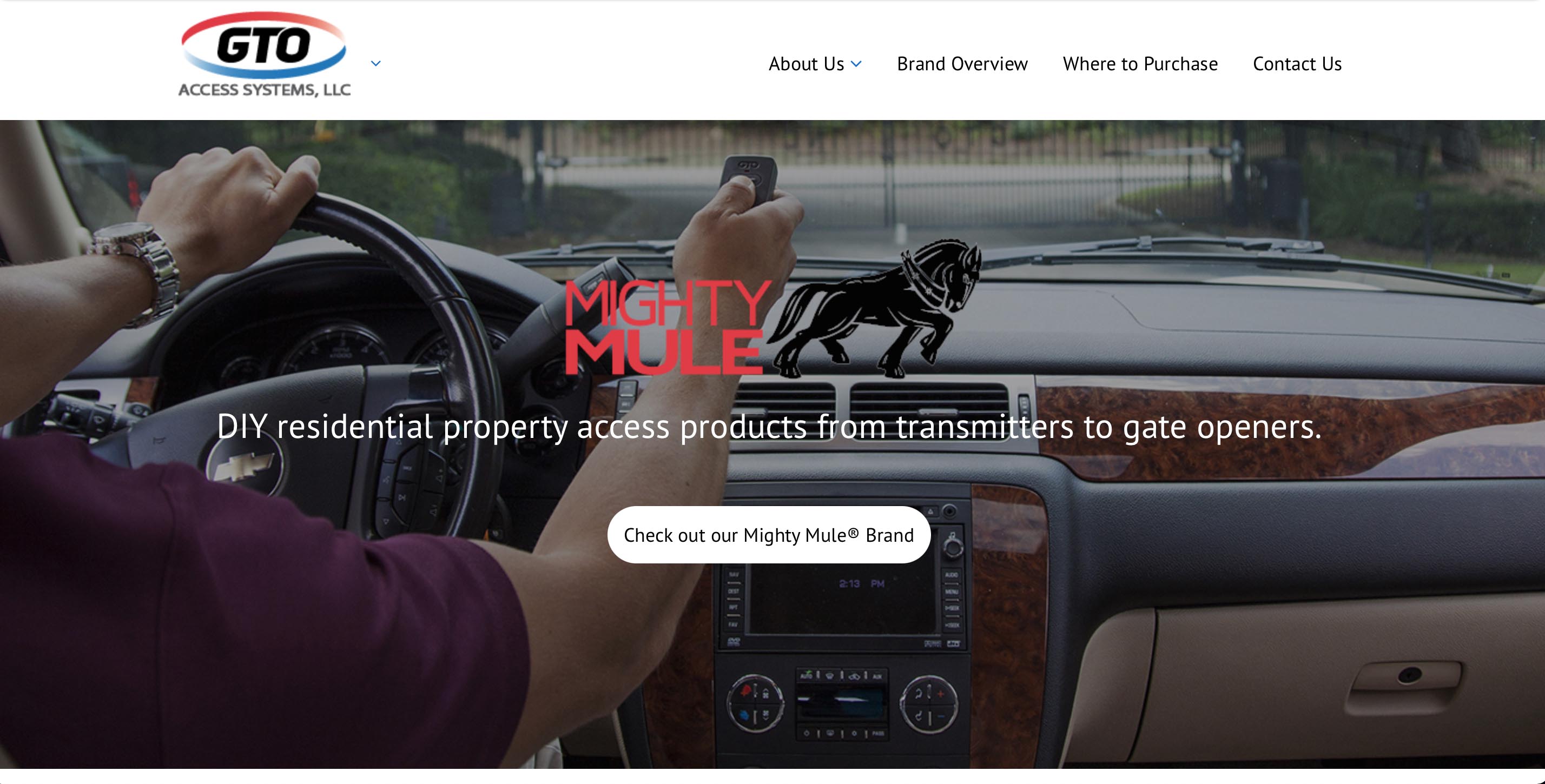
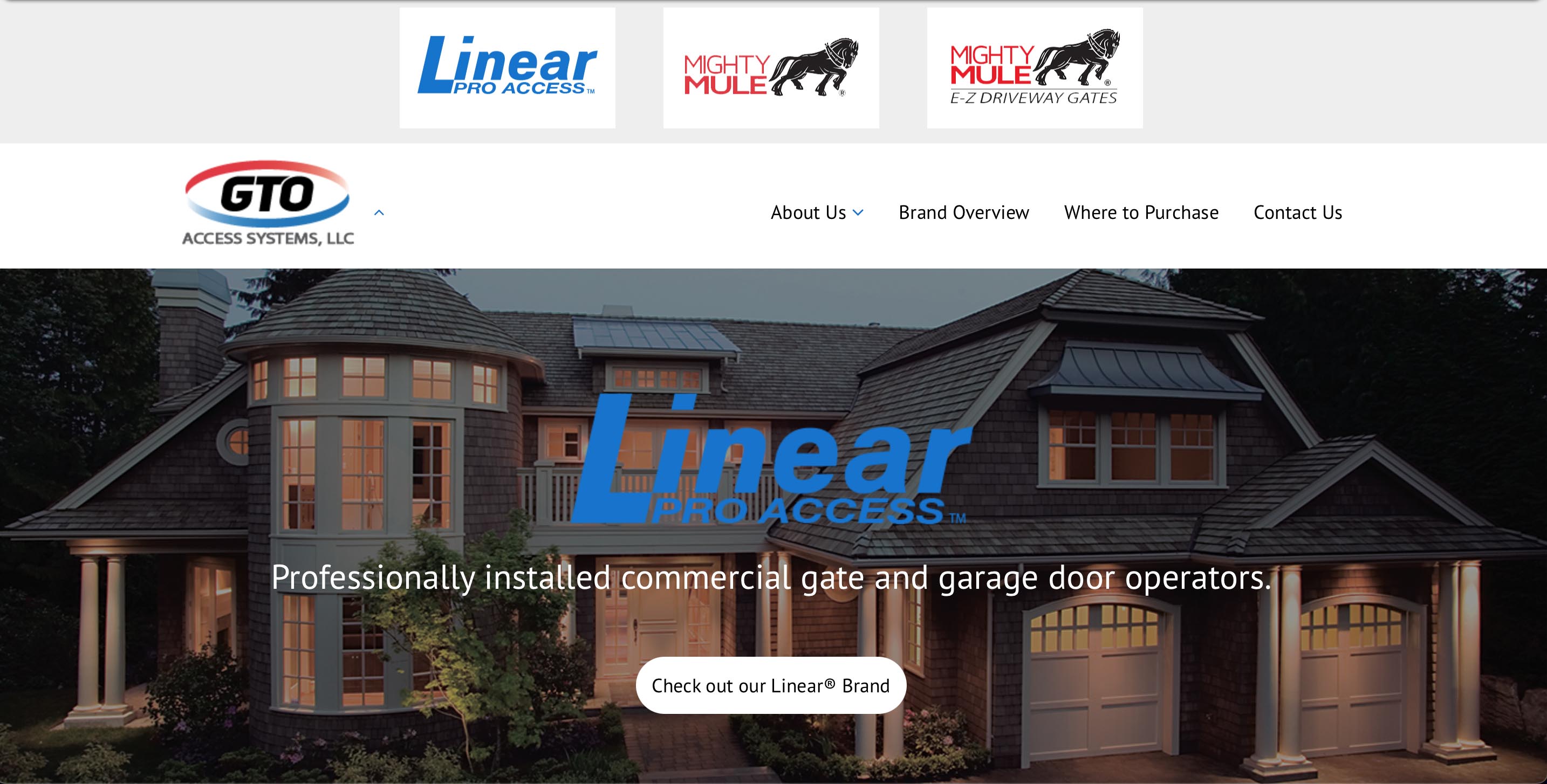
Sadly, my senior designer at the time left the company due to personal reasons in the middle of these projects. We had the new branding completed, but this was a situation where I was filling big shoes in a short amount of time. We didn’t have the budget the fill the position so I had to grow to fill the gaps for our already small team. I started with tackling the UI system first and planning out how to build each of these sites on Wordpress with a custom theme that could be extended across all of them.
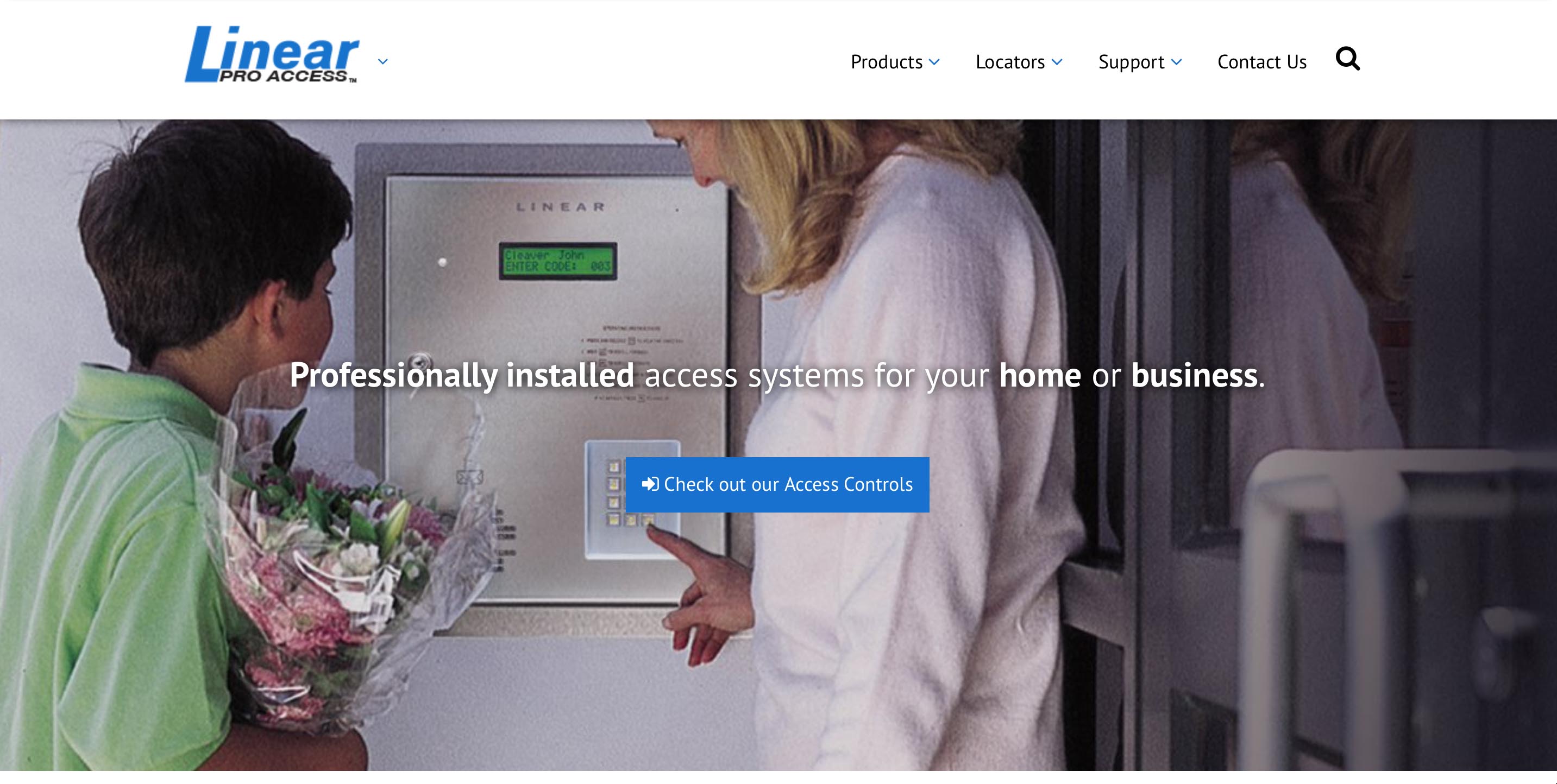
A simple custom theme that allowed users to search each site for product information and callouts to reach out to sales or buy-directly.
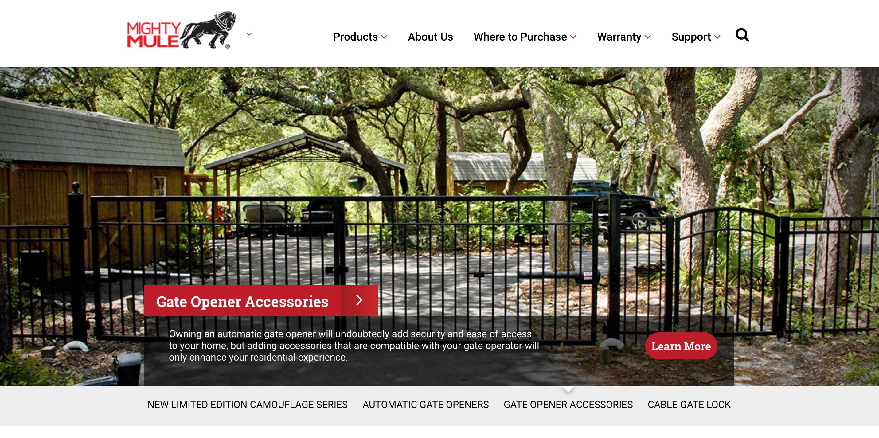
As you can likely tell, GTOAccess was the parent brand with Mighty Mule and Linear being sub-brands. It was important to relate them, yet make them feel relevant to their target markets (DIY retail vs. pro-installed B2B).
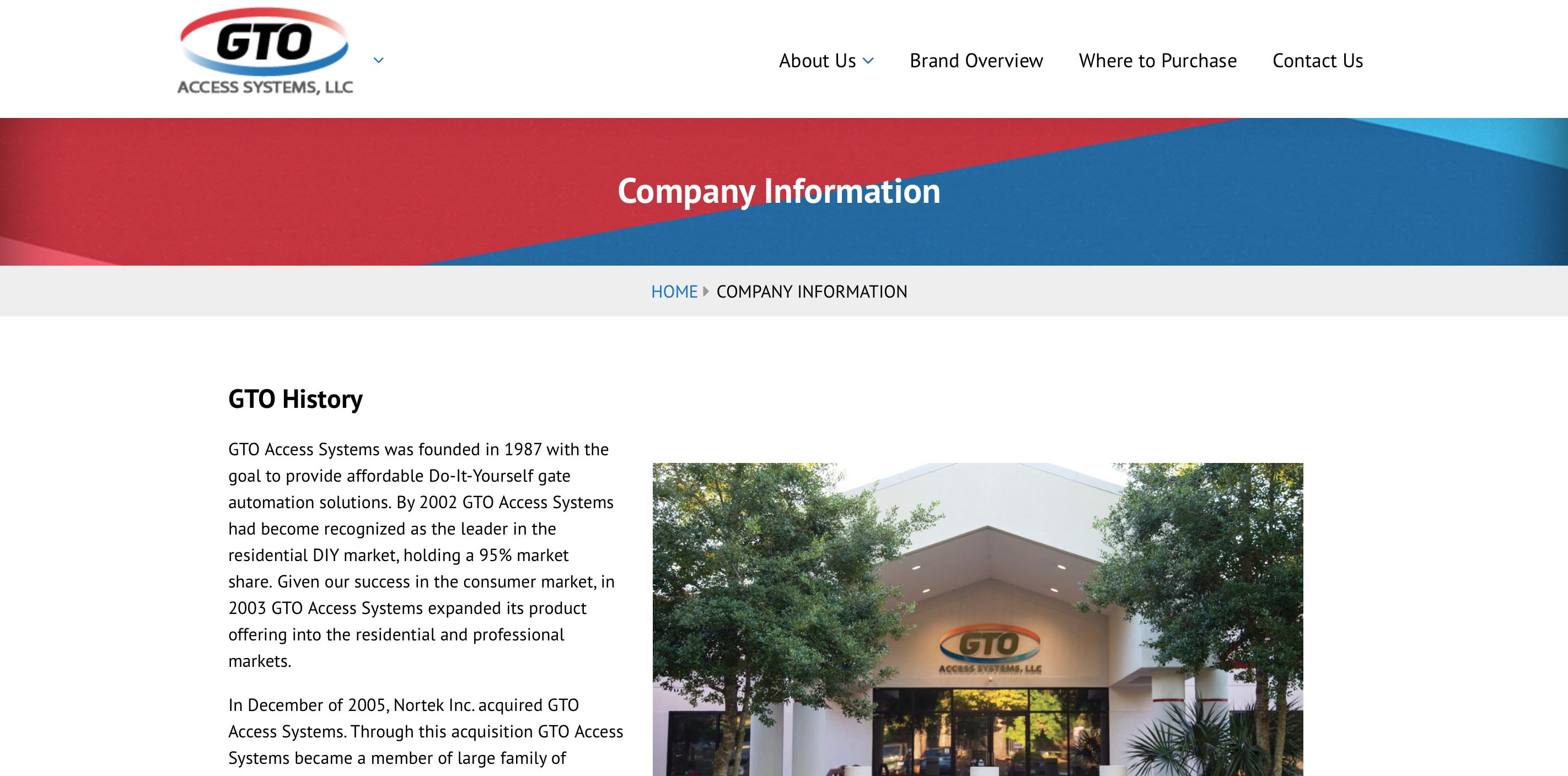
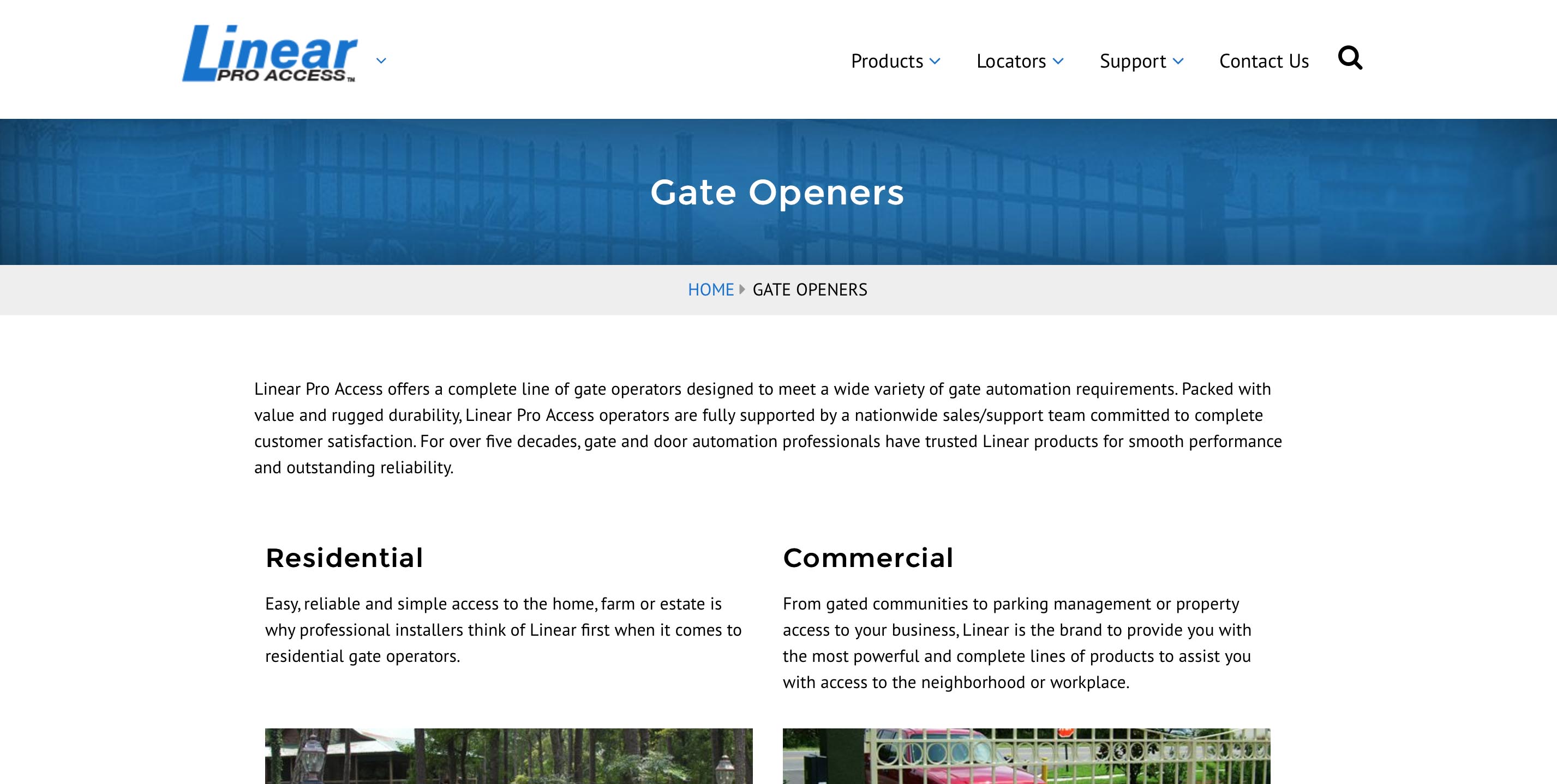
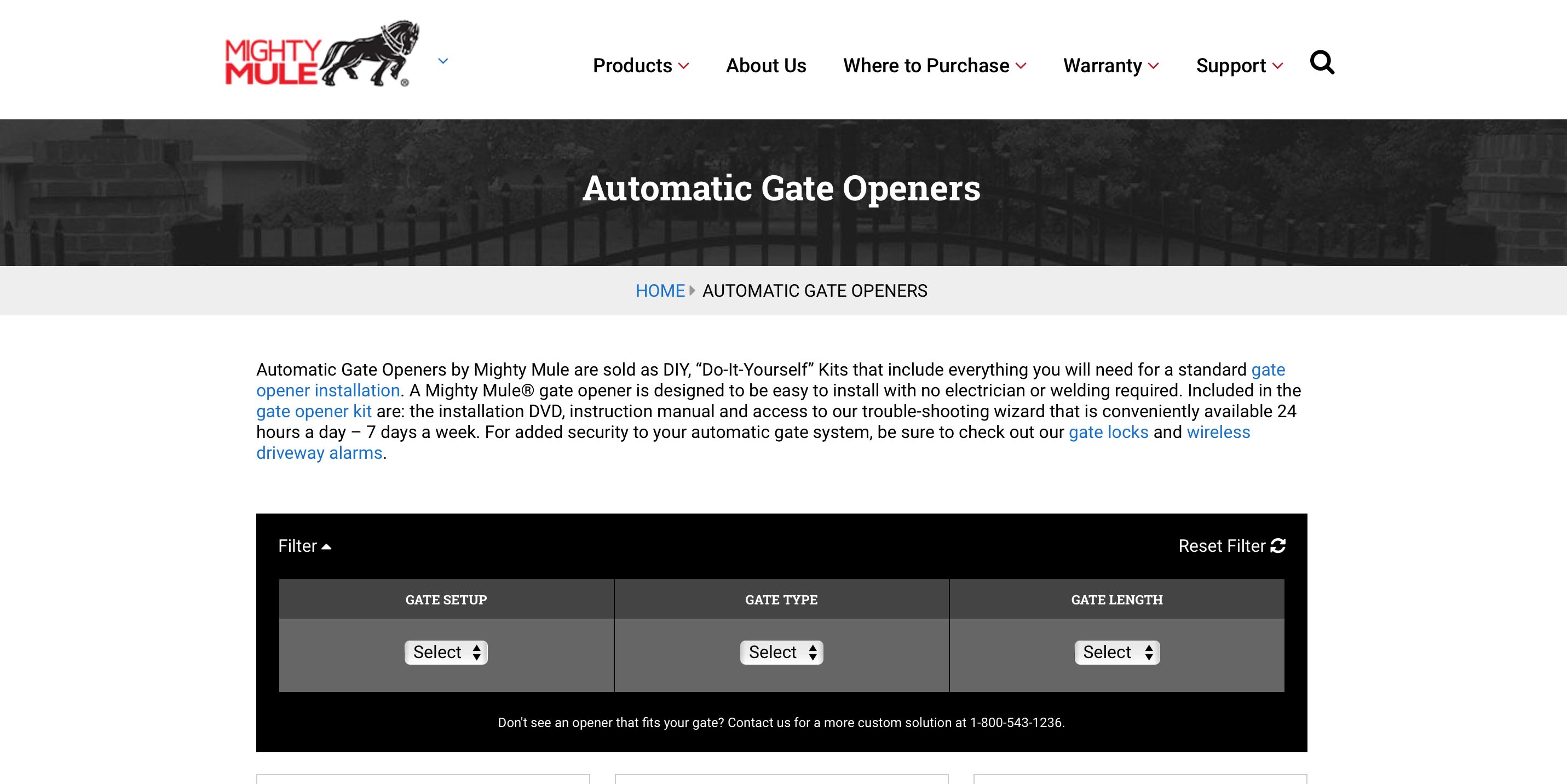
Once I had the groundwork laid down on the first site completed, extending our codebase was a fairly simple process. This gave me room to meet with marketing, sales, and even R&D towards the end of the project, to figure out how extend the new design language to things like packaging to give a new face the new products we would be launching. It was cool to design packaging that would be visible in Home Depot.
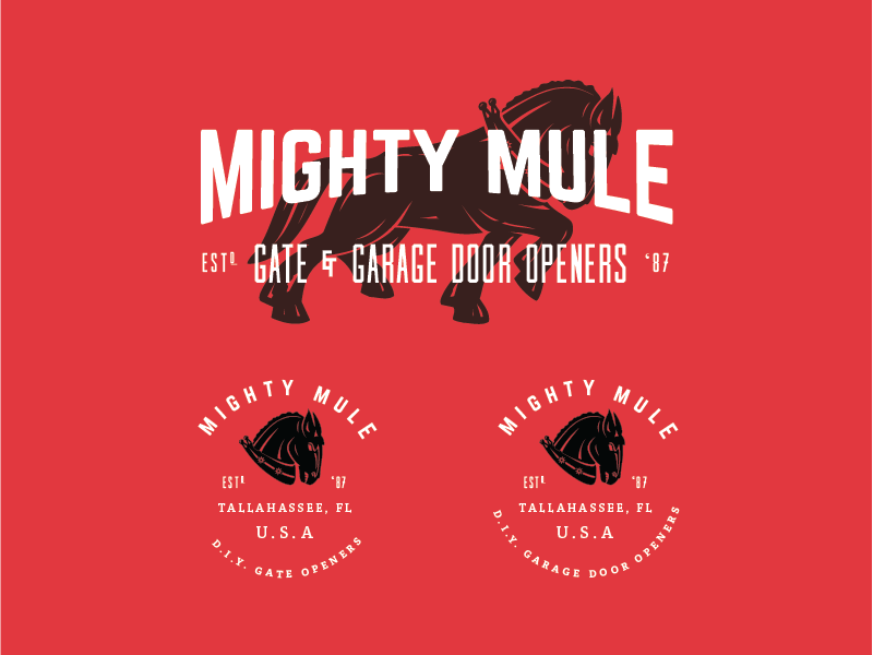
A branding sample: some of these new logos were implemented on a new line of smart devices for the Mighty Mule brand –– a DIY home-access brand. The updated branding leaned more into its rural roots with a modern feel.
Overall, these projects took about a year in between the teams day-to-day tasks and created new sales funnels that weren't there before. The new branding was a hit among customers new and old and paired with our SEO strategies and an updated e-commerce site the company successfully launched its new line of products across two brands.